Redesigning the InterCaribbean Logo
I chose to redesign the InterCaribbean logo during a period when I was deeply immersed in travel blogging. This project allowed me to blend my love for travel with my passion for design, and I was excited to see how my creative ideas would translate into real-world mockups.

The Process
Conceptualization
- I started by sketching various logo ideas on a notepad. The goal was to reimagine the existing logo, retaining the brand’s essence without replicating it exactly. I aimed to create a design that was fresh yet familiar.


Color Palette:
I decided to stick with InterCaribbean’s original color palette, as the vibrant, tropical hues aligned well with the brand’s identity. These colors helped maintain a connection to the original logo while giving me the freedom to innovate with the design.
Color Palette:Design in Photoshop:
- After finalizing the sketch, I moved on to Photoshop to digitize the logo. I created multiple versions, both with and without a background, to ensure versatility in different applications.
Mockups
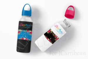
- To visualize how the new logo would work in the real world, I created mockups on various travel-related products:
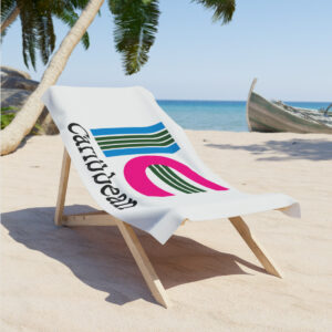
- A beach towel to reflect the logo’s connection to tropical destinations.
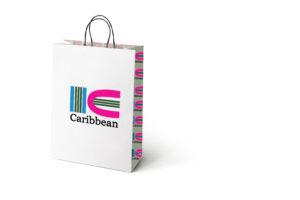
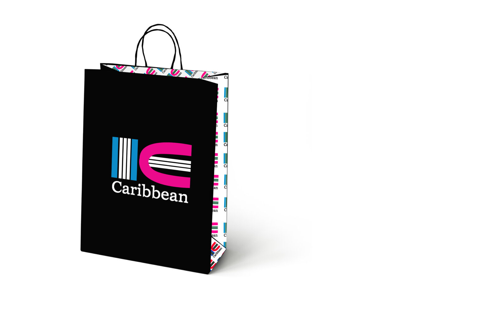
- A paper bag, showcasing how the logo would appear on travel merchandise.
- Teen underwear and a baby bra, exploring its adaptability across a broader range of products, highlighting versatility.
:

Thank You for the Vist 15
